Monitoring predictions
6 Tasks
15 mins
Scenario
U+ Bank uses Pega Customer Decision Hub™ to display a personalized credit card offer to eligible customers on their website. The bank now wants a report on the boost in success rate that the artificial intelligence (AI) generates. As a data scientist, you inspect the Predict Web Propensity prediction that aims to optimize the click-through rate of the web banners that contain the credit card offers.
Use the following credentials to log in to the exercise system:
| Role | User name | Password |
|---|---|---|
| Data scientist | DataScientist | rules |
Your assignment consists of the following tasks:
Task 1: Inspect the Success rate graph
Inspect the success rate of the Control group, the NBA Prioritization group, and the Propensity group over time by answering the following questions:
- Is the success rate of the Control group stable over time? Is this expected?
- Is the success rate of the NBA Prioritization group higher or lower than the success rate of the Control group? Is this expected?
- Is the success rate of the Propensity group higher or lower than the success rate of the Control group? Is this expected?
Task 2: Inspect the Lift graph
Inspect the lift that the prediction generates by answering the following questions:
- What is the current boost in the success rate that the AI generates?
- What is the trend of the lift?
Task 3: Inspect the Performance graph
Inspect the performance of the prediction by answering the following questions:
- What is the current performance of the prediction?
- What is the current distribution of the prediction?
Task 4: Inspect the Propensity percentiles graph
Inspect the Propensity percentiles graph by answering the following questions:
- What is the trend for the 90th and 10th percentile for prediction output?
- Is there a reason for concern?
Task 5: Inspect the Propensity decile distribution graph
Inspect the propensity decile distribution of the prediction by answering the following questions:
- Where does the Propensity decile distribution graph peak?
- Is there a reason for concern?
Task 6: Inspect individual predictors
Inspect the numerical predictor Age and the categorical predictor CLV by answering the following question:
- Is there any reason to suspect data drift for these predictors?
Challenge Walkthrough
Detailed Tasks
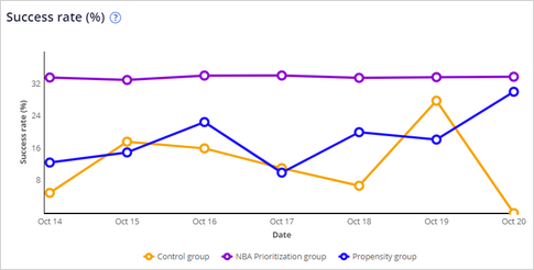
1 Inspect the success rate graph
- On the exercise system landing page, click Pega CRM suite to open Customer Decision Hub.
- Log in as a data scientist:
- In the User name field, enter DataScientist.
- In the Password field, enter rules.
- In the navigation pane of Customer Decision Hub, click Intelligence > Prediction Studio to open Prediction Studio.
- On the Predict Web Propensity tile, click Open prediction to inspect the Analysis tab.
- Question: Is the success rate of the Control group stable over time? Is this expected?
Tip: The success rate of the Control group is dependent on customer behavior and engagement policies, so it may change over time.
- Question: Is the success rate of the NBA Prioritization group higher or lower than the success rate of the Control group? Is this expected?
Tip: The success rate of the NBA Prioritization group is expected to be higher than the success rate of the Control group because the Next Best Action arbitration formula decides which credit card offer has the highest likelihood of a click-through. The credit card offer is random in the Control group.
- Question: Is the success rate of the Propensity group higher or lower than the success rate of the Control group? Is this expected?
Tip: The success rate of the Propensity group is expected to be higher than the success rate of the Control group because the AI decides which credit card offer has the highest likelihood of a click-through. The credit card offer is random in the Control group.
2 Inspect the lift graph
- Question: What is the boost in success rate that the AI generates over time?
- Inspect the NBA Prioritization Lift graph.
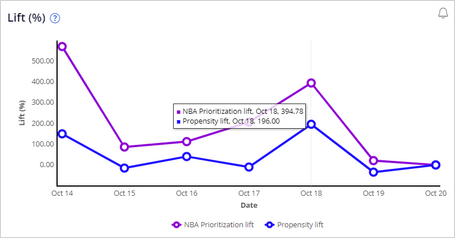 Tip: Hover over a date to display the lift. Note that both the NBA Prioritization lift and the Propensity lift are positive.
- Inspect the NBA Prioritization Lift graph.
- Question: What is the trend of the NBA Prioritization lift?
Tip: Because U+ Bank implemented Pega Decision Management only recently, there is not yet enough data to detect a trend. Once sufficient data is collected, the system generates notifications when there is no lift, or when the lift drops significantly.
3 Inspect the performance graph
- Question: What is the current performance of the prediction?
- Inspect the performance graph.
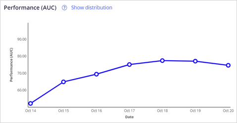 Tip: Hover over a date to display the performance. Notice that performance over time is increasing, which is expected. The more data that is accumulated, the higher the performance.
- Inspect the performance graph.
- Question: What is the current distribution of the prediction?
- Click Show distribution.
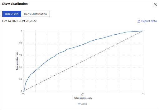 Tip: The distribution can be displayed as a ROC curve and a decile distribution for further inspection.
- Click Show distribution.
- Close the Show distribution dialog box.
4 Inspect the propensity percentiles graph
- What is the trend for the 90th and 10th percentile for prediction output?
- Inspect the Propensity percentiles graph.
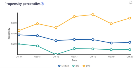 Tip: The lines do not show large fluctuations over time.
- Inspect the Propensity percentiles graph.
- Question: Is there a reason for concern?
Tip: Large movements of the percentile values are a reason for concern. In this case, the lines do not show major fluctuations.
5 Inspect the propensity decile distribution graph
- Question: Where does the Propensity decile distribution graph peak?
- Inspect the propensity decile distribution graph.
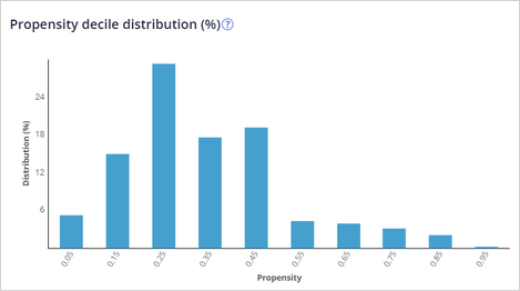 Tip: The graph peaks on the low end of the propensity range.
- Inspect the propensity decile distribution graph.
- Question: Is there a reason for concern?
Tip: The Propensity decile distribution graph peaks at the low end of the graph. This peak is considered good behavior. The graph also shows a long, decreasing tail towards the higher propensities, which means the model has received positive responses over time.
6 Inspect individual predictors
- On the Analysis > Predictors tab, in the Predictors field, enter Age and select the Customer.Age predictor.
- Question: Is there any reason to suspect data drift for this predictor?
- Inspect the Customer.Age percentiles graph.
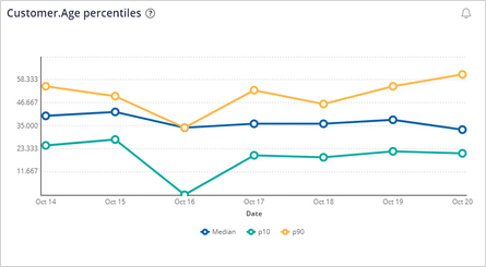 Tip: The Median graph shows a stable value. This does not indicate data drift.
- Inspect the Customer.Age percentiles graph.
- On the Analysis > Predictors tab, in the Predictors field, enter CLV and select the Customer.CLV predictor.
- Inspect the Customer.CLV top values graph.
-
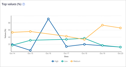
- Question: Is there any reason to suspect data drift for this predictor?
Tip: The values show little change over time. This does not indicate data drift.
This Challenge is to practice what you learned in the following Module:
Available in the following mission:
If you are having problems with your training, please review the Pega Academy Support FAQs.
Want to help us improve this content?