Application accessibility
Application accessibility
Designing for accessibility enables your application to support a wider audience of users. Government regulations, such as the Equality Act 2010 in the United Kingdom and Section 508 of the Rehabilitation Act in the United States, may also require application accessibility.
Note: Government agencies may require certification that an application meets accessibility guidelines. For example, the United States government requires a Voluntary Product Accessibility Template (VPAT) verified by a third party to demonstrate Section 508 compliance for each application release.
Accessibility roles
Pega Platform™ supports the Web Accessibility Initiative-Accessible Rich Internet Applications (WAI-ARIA) standard. WAI-ARIA is a technical specification that defines ways to make digital content and Web applications more accessible to people with disabilities by using WAI-ARIA roles.
Note: The WAI-ARIA standard conforms to the Web Content Accessibility Guidelines (WCAG 2.1) maintained by the World Wide Web Consortium (W3C). Whenever possible, applications should target the A & AA level of the WCAG.
WAI-ARIA roles are specific attributes applied to user interface elements. The roles enable communication between assistive devices and Pega Platform applications about UI elements. For example, a role directs a screen reader to differentiate between a check box and a button and provide an appropriate experience to the user for each control.
Pega Platform supports three types of WAI-ARIA roles. Each role type describes the content or functionality of a specific area within a portal.
- Landmark – The landmark roles organize content within a portal to improve navigation when using a screen reader by providing quick access to specific areas of the page. Landmark content is purpose-specific, relating to the navigation, search, or consumption of content. For more information about how Pega Platform portals use landmark roles to support accessibility, see the Pega Community topic WAI-ARIA roles in a screen layout.
- Document structure – The document structure roles describe the structure of the page content. Typically the document structure roles are not interactive. Document structure includes elements such as row or column headings, notes, or presentations.
- Component/Widget – A component or widget is an interactive interface object. Widget roles map to standard features in accessibility APIs. When the user navigates to a widget, assistive technologies intercept keyboard events and pass them through the web application to the widget.
You can assign role types to a dynamic layouts in a section. By default, Pega Platform assigns WAI-ARIA roles to UI controls and other components, such as screen layouts and dynamic containers.
Caution: If you customize the HTML code associated with a control or create a custom control, apply role types to the UI control in accordance with the W3C guidelines.
For more information on accessibility in Pega Platform applications, see the Pega Community topic Accessibility and Pega Platform. Additional information on web accessibility is available from the W3C.
Accessibility features and updated applications
By default, accessibility is enabled for all users on Pega Platform. Previous versions of Pega Platform required that developers enable accessibility features for individual access groups. If you update an application from a previous version of Pega Platform, update all access groups to clear the Enable accessibility add-on check box and remove the PegaWAI ruleset from the list of production rulesets for the application and all access groups.
Note: Previous versions of Pega Platform enabled accessibility for individual end-user access groups through use of the PegaWAI ruleset, which conformed to the WCAG 1 standard. To avoid segmenting users into different access groups based upon the need for accessibility features (which may be perceived as biased or discriminatory behavior) and ensure compliance with the WCAG 2.1 standard, discontinue use of the PegaWAI ruleset in any application updated to the current version of Pega Platform.
Check your knowledge with the following interaction.
Pega Platform best practices for accessibility
Pega also recommends accessibility best practices to support the use of assistive devices. The following table lists several configuration options developers can perform to improve application accessibility.
| Configuration | Purpose |
|---|---|
| Provide labels for all controls, such as buttons, links, icons, and input fields, even if the label is hidden. | Announces the purpose of the control to users with a screen reader. |
| Configure a high-contrast color scheme when customizing the application skin. | Ensures the contrast is sufficient for users with vision limitations. |
| Set keyboard commands for controls, following the recommendations provided by the W3C as part of the WAI-ARIA Authoring Practices. | Enables expected keyboard controls for users limited to keyboard-only interactions. |
| Use buttons only for actions, and use links only for navigation. | Provides a consistent user experience that an assistive device can describe to a user. |
| Enable use of the close button to dismiss an overlay or modal. | Provides a navigation element that a user can access through an assistive device. |
| Mark only one container as the main content area by default. | Provides the ability for an assistive device to identify the main work area of a form. |
| Use a drop-down list of options instead of text entry for fields with predictable answers (for example, a series of numbers or colors). | Provides a visible list of options that an assistive device can read to a user. |
For additional guidance on best practices for configuring designing an accessible application, see the Pega Community topic Best practices for accessibility. For more information on how individual controls and actions support accessibility, see the Pega Community topic Supported accessible run-time behavior.
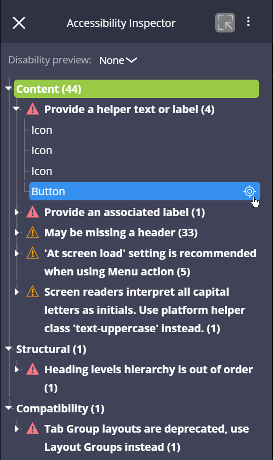
The Accessibility Inspector
The Accessibility Inspector tool allows you to identify and rectify some of the accessibility issues within your application. The Accessibility Inspector is available in both App Studio and Dev Studio, and the User portal when launched from Dev Studio.
Caution: The Accessibility Inspector identifies common Pega-specific accessibility issues within your application but is not a replacement for formal automated and manual accessibility testing. You should always test with an automated testing tool like axe-core and actual users, as automated tools only detect about 30% of accessibility issues.
Audit for compliance with best practices
When active, the Accessibility Inspector identifies configurations that may negatively impact application accessibility.
The Accessibility Inspector organizes the issues found into four categories.
- Content – Issues with the configuration of controls. For example, an icon is missing helper text or a label.
- Structural – Issues with the organization of content within the portal. For example, the heading level hierarchy is out of order, which can potentially confuse screen readers.
- Interactivity - Issues affecting how assistive devices navigate the UI. For example, the skip to content navigation is missing from the portal configuration, which prevents users from using the Enter key to navigate to the main content.
- Compatibility – Issues with the Pega UI elements used on a form. For example, a form uses a tab group layout, which is deprecated, instead of a layout group.
To inspect UI configurations that reduce application accessibility, expand the arrows to the left of the Content, Structural, Interactivity, and Compatibility headings. Once expanded, you see descriptions of each issue. Expand an issue to display the affected UI elements. Hover over a UI element and click the crosshairs icon to open the element in Dev Studio and address the issue.
Preview for color vision deficiency
The Disability preview option allows you to observe how your application appears to users with one of four types of color vision deficiency. The Disability preview provides four modes for simulating color vision deficiencies.
- Achromatopsia (Absence of color)
- Deuteranopia (Red Green confusion)
- Protanopia (Red Green confusion)
- Tritanopia (Yellow Blue confusion)
To mimic the appearance of your application as perceived by a user with a color vision deficiency, click the drop-down to the right of the Disability preview label. By default, the Disability preview is set to None. Change the preview setting to temporarily shift the color palette to match the selected color vision deficiency. To restore the original color palette, select None or close the Accessibility Inspector.
In the following image, move the slider to compare the standard display of a form with the display as perceived by a user with tritanopia.
Check your knowledge with the following interaction.
If you are having problems with your training, please review the Pega Academy Support FAQs.
Want to help us improve this content?