
User interface controls
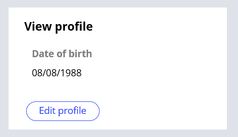
Controls are UI elements that determine how data, text, images, and other information appear on user forms for both display and user input. Each control type has a unique look and provides different functions for users. The system assigns a default control when you define a new field. For example, customers must create a profile to sign up for a rewards program. You define a date field for customers to enter or select their date of birth. The system assigns a Date Time control to the date of birth field.
Controls are not necessarily associated with data. For example, once customers have created a profile successfully, they can view and edit their profile. You create a button control that allows customers to edit their profile information; there is no data associated with the button control.
Data validation with controls
Controls provide the most common approach to validation. You can validate user input with controls by leveraging control types, required fields, and editable settings.
Control types
Using the correct control type for a specific purpose ensures users enter valid values. The following table shows example use cases for different control types.
| Use case | Control type | How the control helps validation |
|---|---|---|
| Users must enter a date that includes day, month, and year. | Date Time | Selecting a date from a calendar icon ensures that users enter a date in a valid format. |
| Users must select one of three possible loan types. The user must see all types on the form. | Radio buttons | Restricts choices to a set of valid values and allows users to select only one value. You can use radio buttons when only a small number of options (for example, fewer than five) is available. |
| Users must select one of 10 types of office chairs from a list. The options do not need to be displayed on the form. | Dropdown | Restricts valid values to the ones that appear in the list. A drop-down list presents the options only when users click the control; this helps reduce the clutter on the form. |
| Users must select the country in which they reside from a list. The user can enter text in the control to help find the right country. | Autocomplete | When users enter one or more values in the control, the control filters the available options. This helps users find an option in a list if there is a large number (for example, more than 20) of possible options. |
| Users select an option to purchase extra travel insurance. | Checkbox | Users can select the check box or leave it blank. This option ensures that a true/false property is either true (selected) or false (unselected). |
Editable settings
You can use editable settings on controls to restrict the input values to valid formats. The settings are specific to the control type. For example, you can specify that users cannot enter dates as text — users must select a date from the calendar icon. It is a best practice to have users specify dates by using a calendar icon to ensure the date entered matches the format expected by the application. You can also specify the minimum and maximum of characters allowed in a text input control.

Required fields
Configuring a control as a required field ensures that the user enters a value. If there is no value, users receive an error when they try to submit a form. In the rewards program profile example, you decide to configure the Date of birth as a required field. If users do not enter a date in the field, an error message appears when users attempt to submit the form. The error message does not appear if there is a date in the field.
In center of the following image, slide the vertical line to see the Create profile view without a date entered in the required field and with a date entered in the required field.
Check your knowledge with the following interaction.
If you are having problems with your training, please review the Pega Academy Support FAQs.
Want to help us improve this content?