Cosmos Home page configuration
Pega Cosmos design theme applications introduce a Home page while continuing to offer traditional user-personalizable dashboards.
Unlike a dashboard, end users cannot customize the Home page. Designers curate the Home page experience, surfacing the most important application information users should see upon login. The Home page can include:
- Application insights or visualizations.
- A banner indicating important system information, such as new application features or upcoming downtime due to maintenance.
- The current user's worklist sorted by priority.
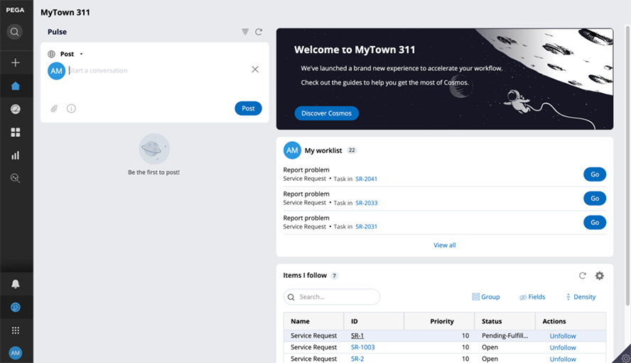
In the following image, click the + icon to learn more about each area of the Cosmos home page.
Home page Worklist widget
When you choose to leverage the default widgets on the Home page, widget behavior can vary based on the configuration options selected.
By default, the Worklist widget renders the assignments of the current user in a flat to-do list. The flat list view of the worklist displays the first three assignments in the worklist, sorted by highest priority. The user can use View all to reveal additional assignments. The flat list view is ideal when the worklist contains a small number of items.
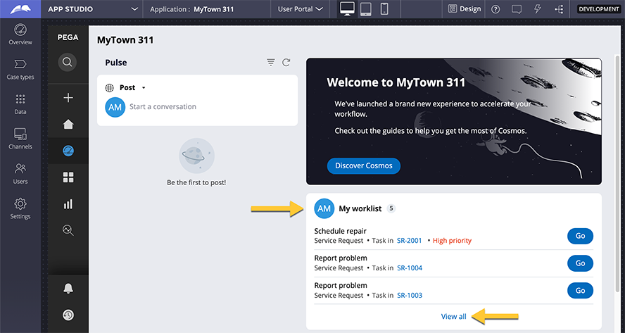
If the worklist might potentially contain many items, developers can use App Studio to configure the worklist to render in tabular format, which offers table personalization including filtering, grouping, sorting, and pagination. In App Studio, developers enter Design mode on the home page to enable the Display as table parameter.
Developers can also enable the Show team assignments parameter to enable a drop-down list that allows end users to switch between the user worklist and the work queue of the team.
In the center of the following image, slide the vertical line to compare the Display as table and Show team assignments parameters.
Home page Welcome widget
A curated Home page can include the Welcome widget. Cosmos includes a default Welcome widget that can be re-used and customized in App Studio and Dev Studio. The default Welcome widget is a good option for light customization of the contents and background image.
Customize the default Home page widget
The default Welcome widget is based on the out-of-the-box (OOTB) Welcome widget design template. This template offers two regions: the Welcome text and the Action area.
In the following image, click the + icons to learn more about each region.
Tip: For best results, use an SVG image with similar dimensions and a black background.
The default Welcome widget can also be removed from the home page and replaced with a custom welcome widget. A custom Welcome widget is a good option when you want a completely different layout and styling.
Check your knowledge with the following interaction.
If you are having problems with your training, please review the Pega Academy Support FAQs.
Want to help us improve this content?