Creating your own design template
Before you create your design template, you must define it and then finalize the details.
Defining the design template
A design template must have the following:
- Purpose: Each template should have a specific purpose but remain general enough to allow for reuse elsewhere. Templates should be created for reusable layouts. One-off layouts can be done with a traditional section and dynamic layout, and be embedded within a template if needed.
- Name: The name of a template should describe the purpose (for example, “List item with image and status”). Template names should be descriptive, but not overly specific. Avoid being so specific that the template could not be used in other locations in the application.
- Icon: A template needs to have an icon that shows the user how the template lays out its contents (your designers should be able to provide these).
- Regions: Regions need to be identified in your template to place content, and should also have descriptive, but general names (for example, “List item with image and status” has regions for “Image”, “Title”, and “Status”).
It is a delicate balance! You should not create numerous templates for each individual scenario as well as avoid creating few generic templates that could be used everywhere. You need to find a happy medium and work with your UX design team to identify reusable patterns that will be created as a design template.
Finalizing design template details
Use the steps below to finalize the details of your template.
1. Define the usage pattern and how it can apply to other applications.
The answer to the following questions can help identify the usage of this template:
- Is it for mobile only?
- Mobile-only templates should have their name prefixed with "Mobile"
- How often can it be dropped into a page?
- Templates that are intended to control the entire page layout should be labeled as a "Page"
- Should it generate a header tag?
- What is the expected markup? How optimal is the DOM generated?
2. Work with your design team to finalize critical details.
- Name of the template
- Usage
- Description
- Name of the regions
- What regions are required
- What control is included inside the template
- Icon for the template
- Name of the template rule
- Responsive behavior within the template
- Other behavior (slide in, transition...)
3. When building the template, follow these best practices:
- For every region, it is important to define if the direction of the dynamic layout is a 'row' or 'column'. The template should be built with the understanding that more than one control can be dropped in a given region.
- Use the out of the box dynamic layout formats as much as possible.
- Avoid using container formats outside of Default or None.
- Do not use an inline style in the template. Use classes that are in the common-helper class file.
4. Follow naming patterns.
Templates are named in a repeatable pattern:
[Location] [Type] with [Regions]
For example: "Mobile page with cards and layout group"; "List item with breadcrumbs, metadata, actions and image"; "Card with image and metadata".
Creating your design template
Once you have finalized the definition of the design template, here is how to create the template.
- Upload the image used for the design template by creating a new Rule-File-Binary that contains the preview of the icon. It is recommended to make the icon as meaningful as possible by showing the different regions handled by the template and how they are rendered.
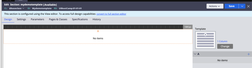
- Using Dev Studio, create a new section. Make sure to define the appropriate 'Apply to' class for this section. For example, if the design template is expected to be used only for case type, set the Apply to class to Work-.
- In the banner, click convert to full section editor to convert the rule.
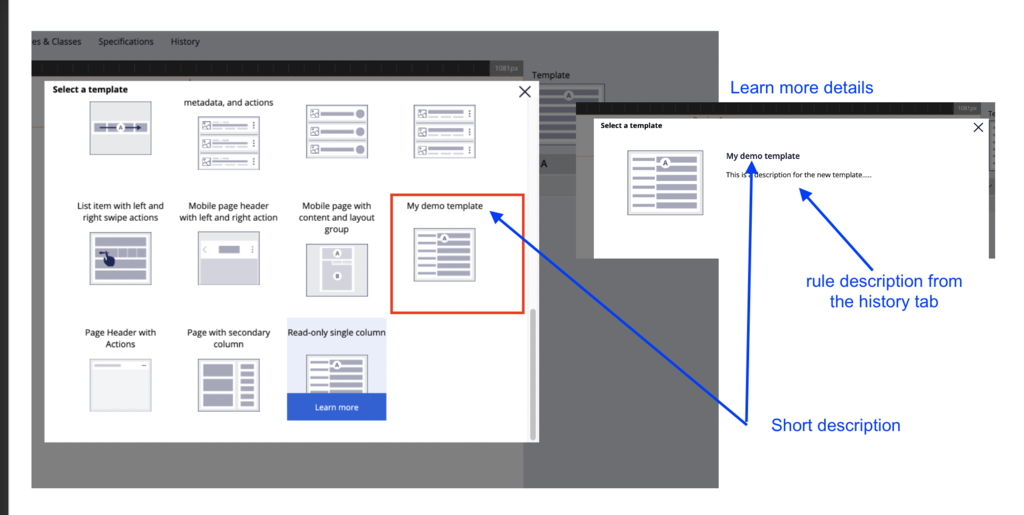
- Set an appropriate short description; this short description is used in the design template picker.
- On the History tab, enter applicable text in the Description field.
- On the Settings tab, make sure to configure the section as a design template by setting the value in the radio button. Also, select the icon image that you uploaded.
- On the Design tab, create the design template using layouts.
- It is possible to insert dynamic layouts in the design template that will not be regions.
- A design template requires a least one dynamic layout to be marked as a region.
- It is possible to include inside the design template some pre-built components that will be included automatically like buttons, links, and avatar.
- To mark a dynamic layout as a region, open the property panel and select the Use as template region check box.
- Enter a region name.
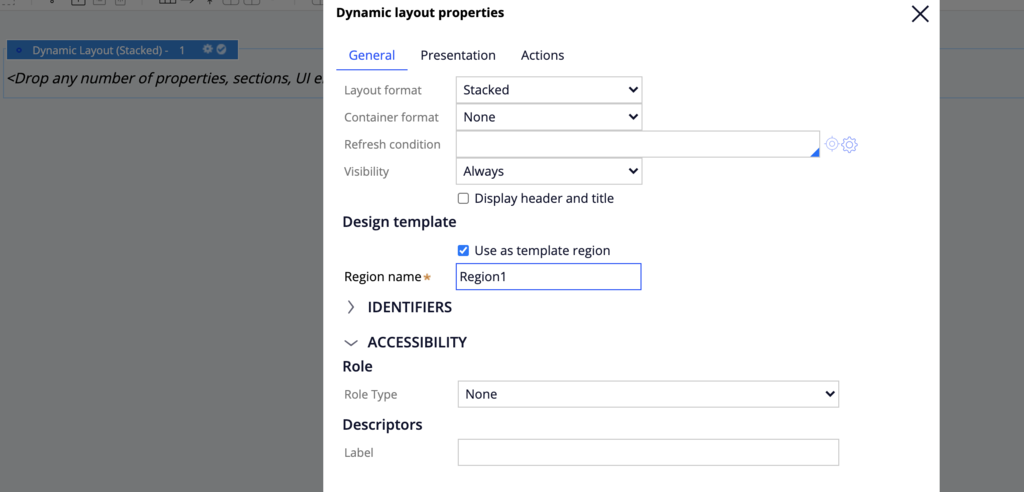
Note: In order to save a design template rule, you need to have at least one dynamic layout marked as a region and have a valid region name.
Once you have created the design template, try to use it inside a section by changing the existing design template. The newly created design template should be displayed in the list. On the History tab, click learn more to get more details about the template.
Check your knowledge with the following interaction.
If you are having problems with your training, please review the Pega Academy Support FAQs.
Want to help us improve this content?