Dynamic layouts and containers
It is important to differentiate between a container and a dynamic layout.
- A container wraps a dynamic layout inside the contents of the container and adds support for a header.
- A dynamic layout is used to position various elements on the page.
Dynamic layout configuration
Dynamic layouts use flexbox to arrange different elements. In the flex layout model, the children of a flex container can be laid out in any direction and can their size. For example, the field can grow to fill the unused space in the parent container or shrink to avoid overflowing the parent container.
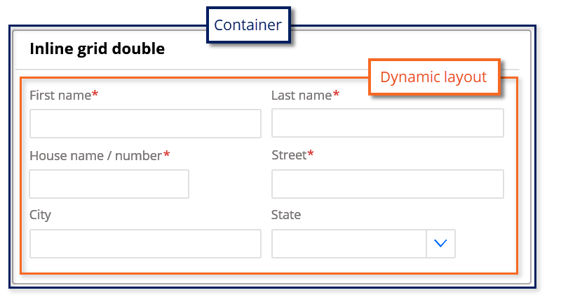
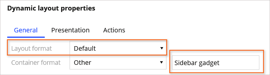
You control the behavior and style of the dynamic layout and the container separately. For example, in the following image, the Default dynamic layout format is included inside the Sidebar gadget container format.
The format of the dynamic layout controls how the elements are arranged in columns or rows. The following formats are recommended depending on the required direction.
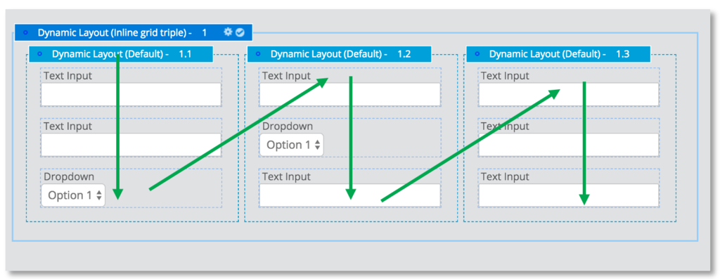
In the following image, click the + icons to learn more about each layout.
Container configuration
The two container formats typically used are:
- None – The default configuration; the container is not wrapping the dynamic layout
- Default – The dynamic layout is wrapped inside a card that usually has a white background and margin around the outline
You can use other formats to display notifications and banners.
Note: Pega recommends that you keep the number of container formats small. Use helper classes when necessary to alter the behaviors of the container presentation.
A container wraps the dynamic layout inside a card layout as content and supports header and other advanced behavior.
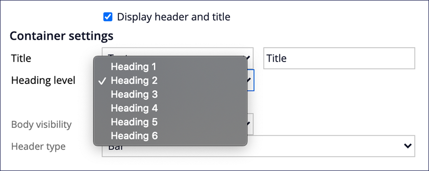
In the following image, click the + icons to learn more about each setting of the container header.
To add the header to a container, select the Display header and title check box. The header of the container supports the following types:
-
Bar - Always visible; this is the default value
-
Collapsed by default - Content of the container can be lazy-loaded or expanded.
-
Expanded by default - Allows the user to collapse the content as needed
Note: While it is possible to set the container format to None or select the 'Display header and title check box, Pega strongly recommends that you do not use this configuration. There is no styling generated when using the 'None' format. This can lead to incorrect styling of the container.
When you use a container with a header, it is important to structure the page by using the most appropriate heading level.
Optimized layouts
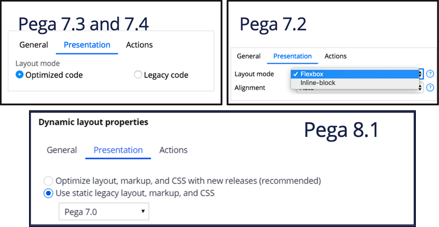
In Pega Platform™ 7.2 and later, all dynamic layouts use flexbox by default to reduce the markup and CSS needed to render these layouts. Older layouts must be manually upgraded to use the flexbox layout.
Note: Review the settings In the Presentation tab to determine if the dynamic layout is optimized.
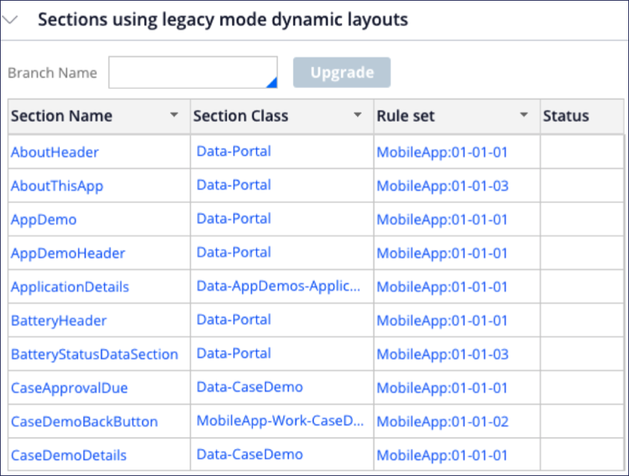
Tip: Use the Client-side template landing page (Configure > User Interface > Application Readiness > Client-side templates) to find the sections using non-optimized layouts. The tool creates a branch for all sections that must be upgraded.
Nesting layouts
Dynamic layouts can be nested within each other to achieve the required design. However, always optimize the number of dynamic layouts to reduce the DOM size and improve the rendering of the UI.
In general, the nested dynamic layout is not required when wrapping a single item inside the layout and should be removed.
For inline grid double and inline grid triple, nest a default layout to ensure that the tab order follows the visual order of the columns. Test that keyboard-driven users can tab through the screen in the same way as the visual layout suggests.
Avoid nesting layouts unnecessarily. Layouts carry styles, such as padding and margins, that may impact alignment and spacing on the generated UI.
Additional nesting guidelines:
- Incorporate nesting to control the UI for the end user’s benefit
- Do not nest simply so that it is easier to view for you as a developer
- Do not use empty dynamic layouts to create empty space or for rendering a header
Note: When nesting layouts, make sure that only the top layout is using the 'Default' container and that the child is using the 'None' container format. Nesting dynamic layouts and setting 'Default' on all the containers will lead to double spacing issues.
Spacing
Spacing originates from both the dynamic layout and the container components. It is critical that you define how the spacing is calculated and know the spacing margin settings for all sides. Failure to correctly configure the spacing for the container components leads to misalignment and double-spacing issues.
The dynamic layout format provides the following spacing settings:
- Margin between items within a layout through item spacing

- Minimum height of an item
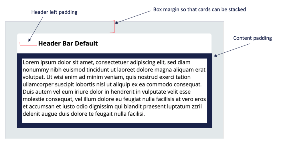
The container format provides the following settings:
- Padding on content
- Margin on box
- Left-padding on container header
Spacing issues
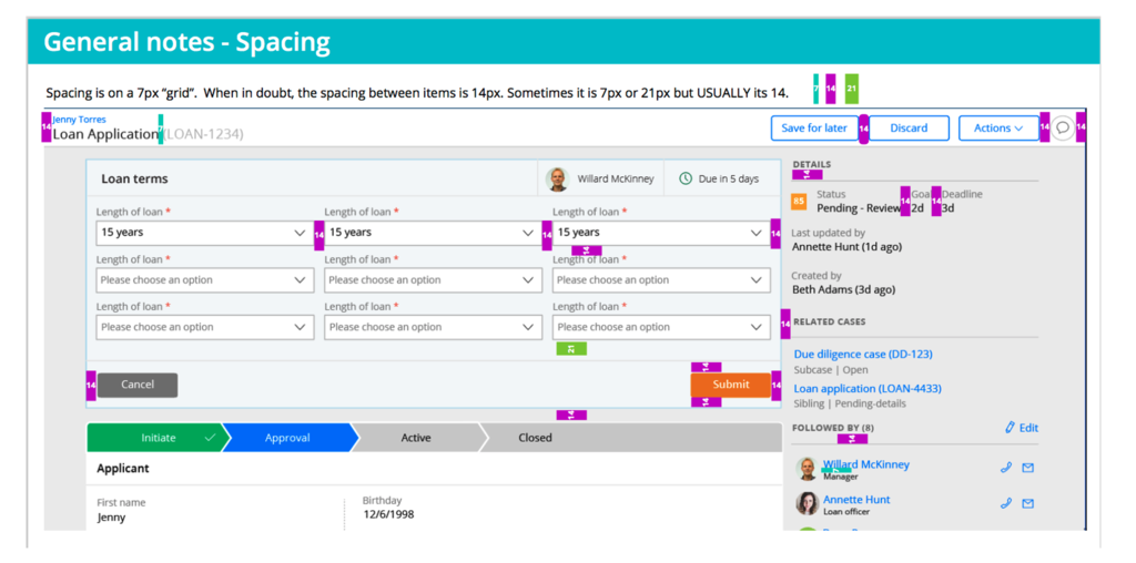
Consistent spacing throughout an application is critical. The UI-Kit design system is on a 7px grid system and the spacing between items is usually 14px.
Using the right container format and dynamic layout is critical when implementing a design so that spacing is consistent.
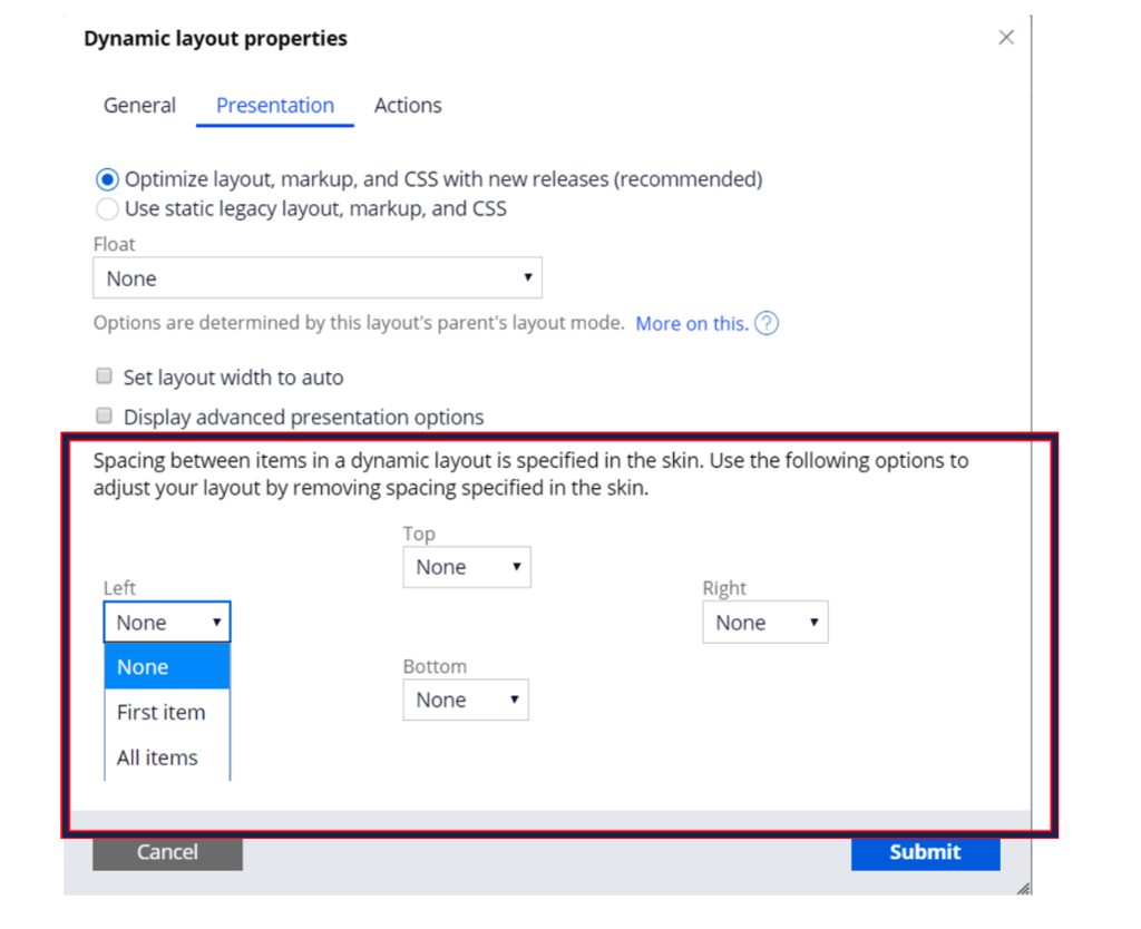
It is possible to modify the spacing between items for a given instance of the dynamic layout by configuring the spacing under the presentation tab of the dynamic layout.
- None (spacing is preserved)
- First/Last item
- All items
Note: Configuring the spacing is important when nesting dynamic layouts. If you do not configure spacing correctly, this leads to double-spacing issues for the last element of the nested layout.
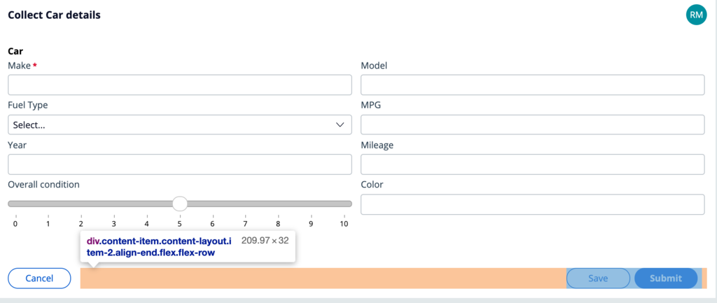
In the following example, you need to make sure that the buttons are left-aligned to the content of the header and the form.
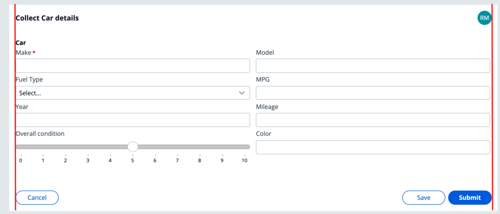
Because the goal is to align the submit buttons to the right, it is typical to nest the dynamic layout inside a top-level dynamic layout and set the flex mode to right-aligned.
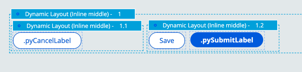
By default, dropping new dynamic layouts from the palette creates a double spacing issue of 14px to the right of the submit button.
Another typical issue with double-spacing is double padding when nesting a layout. In the example below, a stacked layout contains a section include that also contains a stacked layout.
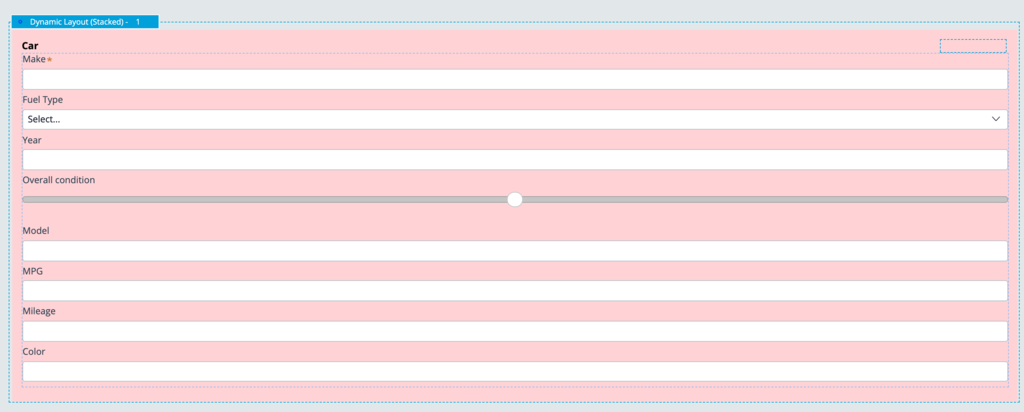
By default, the stacked layout inserts padding at the bottom of each item inside the layout. This leads to unnecessary spacing, as seen at the bottom of the form.
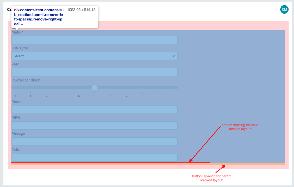
To fix the issue, it is necessary to remove the bottom spacing for the two layouts.
Check your knowledge with the following interaction.
If you are having problems with your training, please review the Pega Academy Support FAQs.
Want to help us improve this content?