
User interface controls and presentation
User interface elements (such as text inputs and layouts) present information and actionable items on the user interface.
User interface elements in Pega Platform
In the Constellation architecture, the system pairs the field automatically with the optimal out-of-the-box control. By automatically paring fields with the optimal control, Pega has greatly improved the process of maintaining and updating applications for our clients.
The UI elements of Pega Platform™ include basic controls that you can use out of the box, including:
- Autocomplete controls
- Charts
- Check boxes
- Drop-down lists
- URL controls
- Rich-text editors
- Text input
Note: For more information about the UI controls that are available, see Configuring fields.
By automatically paring fields with the optimal control, Pega has drastically improved the process of maintaining and updating Pega applications for our clients. As a Pega Business Architect, part of your role on a project using the Constellation architecture is to educate clients on this, and other advantages, of prescribed design.
Control types
Controls are UI elements that determine how data, text, images, and other information appear on user forms for both display and user input. Each control type has a unique look and provides different functions for users. The system assigns a default control when you define a new field.
Using the correct control type for a specific purpose ensures users enter valid values. The following table shows example use cases for different control types:
| Control type | How the control helps validation | Use case |
|---|---|---|
| Date Time | Selecting a date from a calendar icon ensures that users enter a date in a valid format. | Users must enter a date that includes day, month, and year. |
| Radio buttons | Restricts choices to a set of valid values and allows users to select only one value. You can use radio buttons when only a small number of options (for example, fewer than five) is available. | Users must select one of three possible loan types. The user must see all types on the form. |
| Dropdown | Restricts valid values to the ones that appear in the list. A drop-down list presents the options only when users click the control; this helps reduce the clutter on the form. | Users must select one of 10 types of office chairs from a list. The options do not need to be displayed on the form. |
| Autocomplete | When users enter one or more values in the control, the control filters the available options. This helps users find an option in a list if there is a large number (for example, more than 20) of possible options. | Users must select the country in which they reside from a list. The user can enter text in the control to help find the right country. |
| Checkbox | Users can select the check box or leave it blank. This option ensures that a true/false property is either true (selected) or false (unselected). | Users select an option to purchase extra travel insurance. |
Editable settings
You can use editable settings on controls to restrict the input values to valid formats. The settings are specific to the control type. For example, you can specify that users cannot enter dates as text — users must select a date from the calendar icon. It is a best practice to have users specify dates by using a calendar icon to ensure the date entered matches the format expected by the application. You can also specify the minimum and maximum of characters allowed in a text input control.
Styling user interface elements
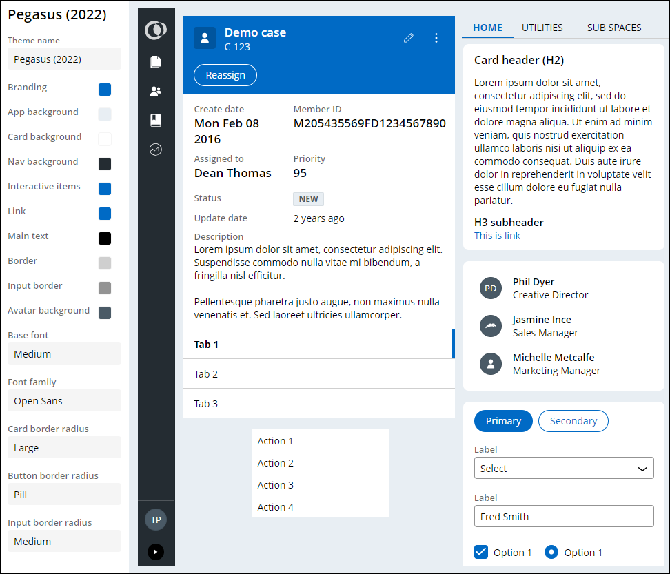
In the Constellation architecture, you can use themes to configure the styling of UI elements such as buttons, links, or headers. Custom themes are particularly useful to ensure your applications meet branding requirements. Changes to a theme affect all UI elements across the application. Establishing a consistent look for UI elements in your application saves development time, gives your application a more predictable user interface, and makes it easier for users to complete forms.
The out-of-the-box Pegasus theme is displayed in the figure below:
Note: To learn more about styling an application, see Defining themes.
Check your knowledge with the following interaction:
This Topic is available in the following Module:
If you are having problems with your training, please review the Pega Academy Support FAQs.
Want to help us improve this content?