Prescribed design in Constellation
The Pega Constellation design system follows a prescribed design: a set of informed default designs and templates with preset configurations to reduce design time, allowing the designer to create pages and flows that focus on user needs. Prescribed design:
- iterates over time as new use cases are discovered or regulated
- does not preclude customization for patterns and components
- aims to reduce time-to-market and increase focus on user needs
Prescribed design allows you to focus on bigger decisions
In design, there are many ways to solve a problem. For example, the location of the Next button in a modal. Some companies place the button in the lower right to allude to turning the page of a book. Some companies place it in the lower center for a more natural reading flow, and some left-align the button when key inputs or information appear at the top of the modal. While all of those solutions may work to solve consistency and readability, small decisions consume both planning time and implementation resources across teams. A prescribed design solves many of these issues on behalf of designers. In simpler terms, the prescribed design allows you to focus on what is actually in the modal and when the modal makes sense in the user’s flow through the application.
The following figure illustrates how a modal displays during the user's workflow:
Prescribed design concepts in the Pega Constellation design system
The Constellation design system uses a number of tools and concepts in a prescriptive manner. Application designers and those working closely with designers should be familiar with the following terms: design tokens, themes, patterns, and components.
Design tokens
Design tokens are tools used to convey key design and UX principles across multiple channels and technologies. Tokens are used to unify style elements across web, desktop, mobile, tools and applications. They are critical to use with Pega Platform applications, as Pega Platform applications blend native and web design elements.
The Constellation design system contains four types of design tokens:
| Design token type | Description | Examples |
|---|---|---|
| Primitive | Represent raw design elements |
|
| Meaningful | Tie functional purpose to Primitive tokens |
|
| Component-shared | Repeated component parts that rely on Component tokens and may be shared across components. These often use both Primitive and Meaningful tokens. |
|
| Component-specific | All components have a set of tokens specific to that component, defining every element of styling from spacing to layout. These may use a combination of Primitive, Meaningful, or Component-shared tokens. |
|
Some design tokens are editable when customizing your applications in order to allow for custom branding. Examples include meaningful tokens such as base.palette.brand-primary or changing basic tokens, such as the default color family.
Themes
Themes are simple settings used to style an application according to brand standards.
The following figure illustrates three examples of themes that include branding for text, colors, and buttons:
Patterns
Patterns are repeatable and scalable combinations of components and user flows that create a consistent experience.
The following figure illustrates three examples of patterns that can be reused in an application:
Some examples of patterns in the Constellation design system include:
- workflows to find and choose content, such as search & select and search results
- system messages and responses, such as error notifications, empty states, and warnings
- navigating information through main navigation and breadcrumbs
- moving through work stages
Components
Components are UI elements and combinations that perform a specific function.
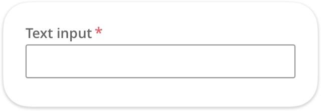
The following figure illustrates a common UI element, the text field:
Complex components that have a focused business goal and may be fully functional within any context are called widgets. For example, a Home page welcome widget that allows you to define what message your users receive when they first log in to your application.
Check your knowledge with the following interaction:
Prescribed experience
A true design system is holistic, easily upgradeable, and creates a prescribed experience. Design patterns, UI components, technical behavior, and visual treatments are complementary and meant to be used in a specific fashion to solve common business problems, improve speed and workflow of users, and meet or exceed legal requirements, such as accessibility or localization.
However, this does not mean that there is no flexibility or creativity within a design system. Many final decisions about placement, the surfacing of content, the flow of work to be done, and an application's branding is up to the designer working in the system. As a designer, you organize ideas, optimize flows, and focus on what really matters: helping users accomplish their goals and serving the needs of the business.
The following figure illustrates the relationship between different parts of a design system:
Check your knowledge with the following interaction:
This Topic is available in the following Module:
If you are having problems with your training, please review the Pega Academy Support FAQs.
Want to help us improve this content?


